

Tripled conversions by improved mobile flow

The challenge
Mobile wasn't working
Clunky flow
Designed for desktop
Asked for too much, too soon


Before...
.svg)
There is a lot of information to take in for a simple action of adding a credit card
Spacing and text sized not utilized for mobile
.svg)
Does not give the authenticity feel.
Does not match Geeker’s band
.svg)
There are a lot of options that one can choose from, this can be overwhealming
Options which are not clickable increase cognitive overload and confuse the user
.svg)
Job summary with the estimate takes up a too much space
Title too large, and too close to the logo.
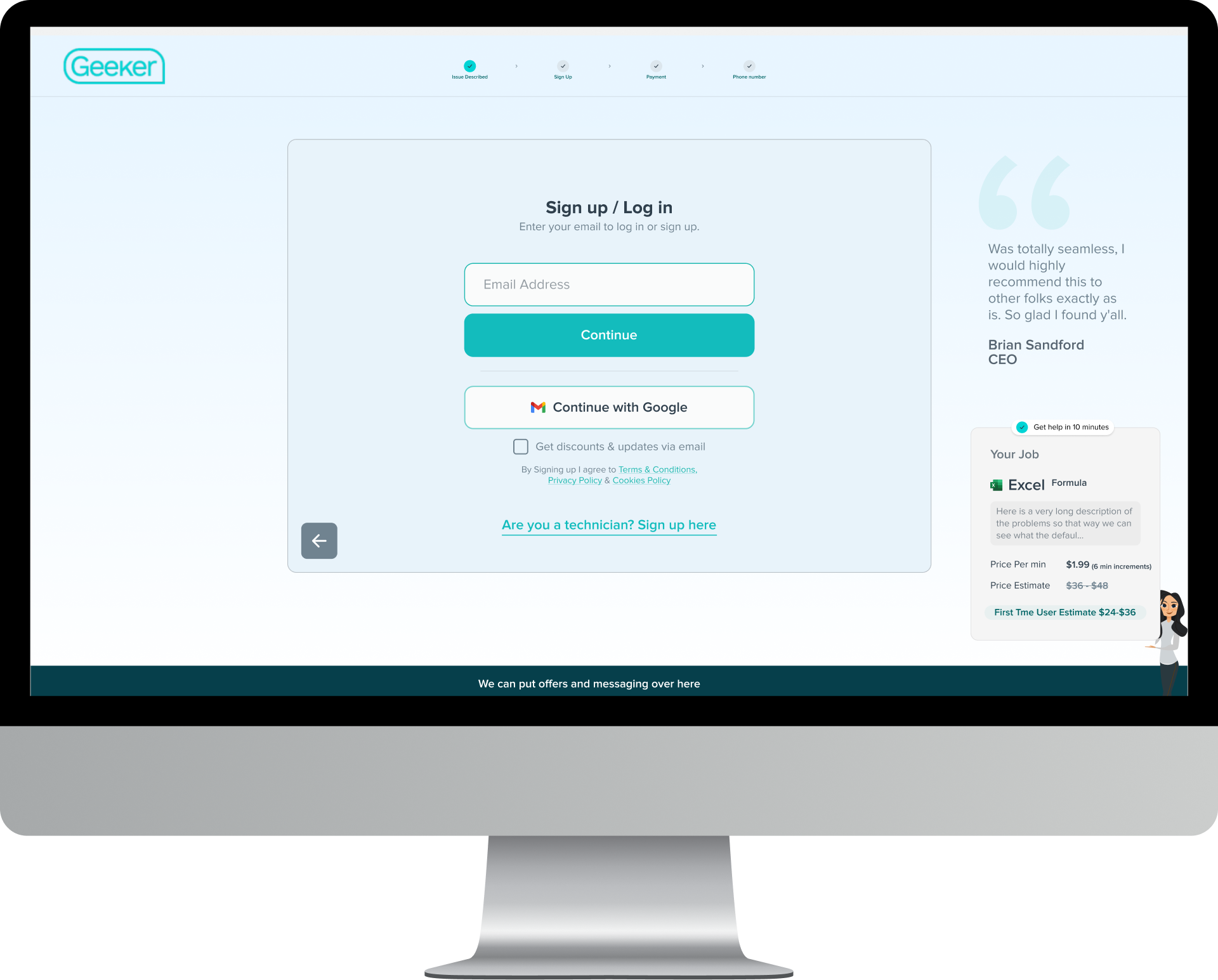
Strategy & execution
I redesigned the mobile signup flow for tap-first interactions. The flow was restructured step by step to reduce density per screen and clarify progression. Decisions were informed by FullStory funnels and session replays.
We ran focused brainstorming sessions around the mobile flow.I led the design direction. The copywriter handled microcopy once the flow was defined.
I delivered final designs to the development manager. I reviewed the implementation using video feedback to catch missed details—font sizes, spacing, and colors—that affect the overall experience.
Top Screens
Top software categories surfaced first instead of long lists
Tap-first flow, not a compressed desktop version
Used to advocate for services which are not used often - users are lead to a page with search where they can expand the full range

Each step focused on a single task
Pricing and timing shown before payment
Photo option could be quicker for users to explain the problem

One text box for all CC details that flows from one to the other to minmized the taps
Extra reassurance to know that they are safe to enter their details
Easy visualize card details to make sure the right information was entered
.svg)
Phone number moved to the final step after payment when the user is committed
The users know what to expect - giving them the confidence throughout the process that they are in the right place

Geeker works best on desktop for screen sharing.After signup, a pop-up explained how to continue on computer.Users could also stay on mobile.

Answering the question before they asked. What should I do now?
Count down is longer than normal wait time so that way the waited a very shot durations

Results & Impact
Tripled mobile conversions
Mobile became viable
What didn’t work
What happened next
Impact at Geeker
Landing pages
- Removed navigation to reduce distraction → 57% more signups on desktop
- Shifted hero messaging from consumer to business-focused → 39% lift on desktop, 85% lift on mobile
- Introduced US-focused imagery and "US-based experts" positioning → 34% more completed customer journeys
.png)
Authentication & onboarding
- Tested Google and Microsoft SSO to reduce friction → 0% conversion improvement → added convenience
Pricing & transparency
- Tested visible pricing vs. hidden pricing → 25–40% signup improvement
- Made per-minute pricing ($1.99/min) prominent on service pages → 13–32% conversion improvement
.png)
Services pages
- Simplified content and reduced text-heavy layouts → 6–30% engagement improvement
.png)
Patterns observed
From the client
Her creativity and problem-solving exceed my expectations.

Helped us execute strategically and explore fresh ideas.